Expo 67 - Architecture
There have been two approaches to designing world's fair architecture. One was to dictate the overall architectural style of the buildings like that of the 1893 World Columbian Exposition. The other was to allow pavilion architects free reign in their creative design. Expo 67 officials decided to allow free reign in architectural style as long as participant's pavilions fit in with the overall loose theme "Man and his World."By the time Expo 67 was conceived, city architecture had become quite conservative and filled our cities with economical, predictable tall boxy buildings. It was exactly the unexciting style that the business society welcomed, but the effect was boring and it deprived cities a sense of identity. This same design philosophy proved expensive in large apartment buildings and public housing projects. Worse they robbed the individual or family, who lived there, a sense of identity they had when they lived in individual homes with gardens, porches and yards.
Architects of social consciousness were thinking of solutions to cover more space with less material and for less money in ways that didn't rob the individual of his identity. At the same time these architects wanted to make a creative statement. So when participating countries held architectural competitions for their country's pavilions, some unusual architecture evolved.
Perhaps the most innovative concept to be used at Expo was "space- frame" architecture. In an effort to "Do more with Less" architects covered large spaces cheaply and flexibly, by distributing the building's weight over a wide area, and by using complex techniques involving aluminum, plastic and other materials. The pavilions that used that technique were the United States pavilion, the Netherlands pavilion, the West German pavilion and the two big theme complexes, Man the Producer and Man the Explorer.
NETHERLANDS PAVILION
The Netherlands pavilion was an engineering triumph, a space frame structure consisting of 33 miles (57,000 pieces , each three feet long) of aluminum tubing. They didn't weld or rivet the pieces together, rather it was put together like a Gilbert Erector set, with wrenches. The exhibition room was suspended inside. The technique had its advantages in that if the building needed to expand, the builders could just add more pieces. It was a very flexible approach to building design and gave the structure a feeling of lightness.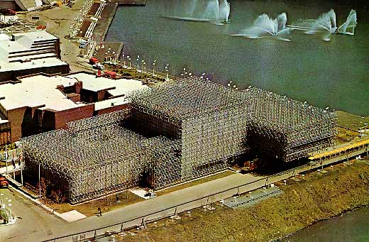 |
The Dutch designed a "space-frame" building out of 57,000 pieces of aluminum tubing. |
GERMANY PAVILION
Frei Otto's elegant space frame tent was used to cover the German pavilion's exhibit area. While it took the architect several years to develop his system, it only took six weeks to build. His system used a roof of steel mesh suspended from eight slender steel masts of varied height, situated at irregularly intervals and supported by steel cables anchored outside the structure, covered an area the size of a city block. The roof's steel mesh net, hung from the guy wires, was then covered by a translucent plastic skin. The tent itself and all of its components were fabricated in Germany.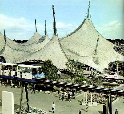 |
The German Pavilion was covered with a modernistic tent. |
The structure adequately dealt with the twin problems of aesthetics and economics. At the least it was a fanciful way of escaping from the tyranny of the box, but it also produced a unique and beautiful interior space. The space below was lit through the transparent plastic and through odd-shaped windows in the roof. As to cost, the building wasn't cheap to build since it was a one of a kind project. But it had potential for its steel and plastic roof weighed only 150 tons; one third to one fifth the weight of normal roofing materials. The tent concept had the ability to adapt to irregular topography of any site. The concept was used again with a much larger tent to enclose the swimming stadium at Munich's 1972 Summer Olympics.
UNITED STATES PAVILION
The United States pavilion's designers choose a Buckminster Fuller dome, two hundred feet high (20 stories) and 250 feet in diameter. As in all of Fuller's domes both little and big, they used three- dimensional units, a triangle on the outside, hexagonal on the inside, and curved to fit a given arc, as its structural basis. By connecting them together in the shape of a dome, it distributed the structure's weight over the whole surface. To avoid his usual half-dome that produced a squat look, the pavilion's designers built a beautifully proportioned, three-quarter sphere that fit the site ideally.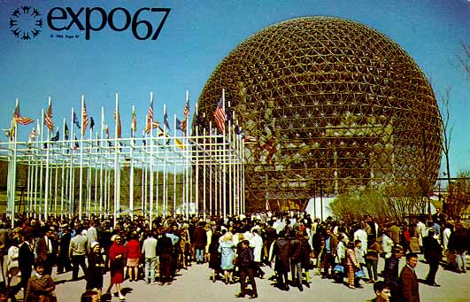 |
The United States Pavilion was a Buckminster Fuller dome. |
It was the most complicated of his domes. It used an elaborate system of retractable shading screens to control the heat within. A computer adjusted the screens in accordance with the sun's rays. Its exterior covering was exquisitely tinted, and surprisingly it was lovely to look at.
MAN THE EXPLORER & MAN THE PRODUCER
The architects (the firm of Affleck, Desbarets, Dimakopoulos, Lebensold and Sise) of the theme complexes were faced with the need to produce, quickly, some large buildings with large areas of open spaces. They decided to make them out of a type of small building blocks, much in the way the Dutch constructed their pavilion out of short metal tubes. The Canadian architects choose the truncated tetrahedron shape,- a four-sided triangular figure with the corners cut off, then flattened so that it looked like a prism. Thousands of these blocks would "nest" with other blocks, large and small, and be built up quickly into theme pavilions.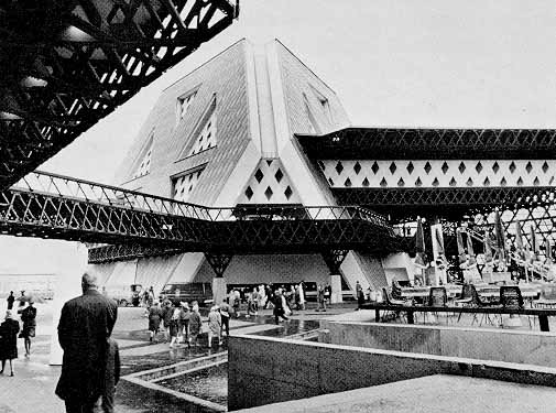 |
Several of the Theme pavilions used "space-frame" architecture to create large inexpensive display spaces. |
The designs and models looked graceful, but the steel fabricators complained that there weren't enough welders in Canada to make the truncated tetrahedrons the architects would need. As a result, the units were bolted together and the pieces heavily braced. The final result was at all graceful, but was heavy and oppressive - miles and miles of thick rusted metal.
OTHER NOTEWORTHY PAVILION ARCHITECTURE
Both the Japanese and Man the Community pavilions used static forms composed of alternating crossing beams. The difference in their shapes was in the positioning of those basic structural elements. In the Japanese Pavilion, vertical stacking created a series of interconnecting cubes, but it closely resembled a concrete but graceful log cabin. On the other hand, the profile of Man in the Community resembled a Chaldean ziggurat. The wooden beams were placed so that the formed wooden polygons that rose in decreasing size from foot to summit.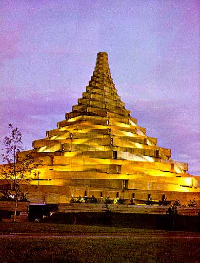 |
Man the Community Pavilion |
The Soviet Unions' Pavilion, by using great walls of glass and aluminum topped by a ski-jump roof, was a departure from its traditional monolithic architectural style. The escalator that lead up into the pavilion prepared the visitor for the surprise of the wide-angled V beams that supported its upswept roof, and carried him into a symmetrically organized display area dominated by a huge bust of Lenin. Inside was a show of technology and the progress of the country's space program.
Britain's was a ponderous castle-like pavilion, whose walls, while made of a kind of cardboard, looked like stone. The jagged top of its 200 foot tall cone-like tower topped by a Pop Art version of the Union Jack, represented incomplete construction. It symbolized Britain's unfinished contribution to the world. Fortunately the exhibits inside were very uplifting as the British made an attempt to charm the visitor.
The French Pavilion, on the other hand, modeled itself on the fine art of sculpture. While it was tastefully executed, architectural critics perceived its fins as merely tacked on. In the great well of the building, the floors full of exhibits were arranged around an open space. Its arrangement of interior stairways and balconies, which gave it an airy feel, was often overshadowed their attempt to overwhelm the visitor with technical displays
Austria's pavilion used the space-frame concept to a certain degree. It used triangular building units to construct large habitable cells. The result was a striking exterior architectural form, geometrical in style, that worked well as interior exhibit space.
HABITAT 67
Habitat 67, an experiment in apartment living, became the permanent symbol of Expo 67 after it closed. It was Canadian architect Moshe Safdie's experiment to make a fundamentally better and cheaper housing for the masses. He attempted to make a revolution in the way homes were built - by the industrialization of the building process; essentially factory mass production. He felt that it was more efficient to make buildings in factories and deliver them prefabricated to the site.Safdie was dissatisfied with both suburbia, which destroyed open space surrounding cities and cut off people's enjoyment of the amenities of city life, and with the high-rise apartment block, which concentrated people on less land. Apartments generally were too small for growing families, and lacked both privacy and outdoor space. He was convinced the later were inadequate as family housing.
He planned Habitat with the goal to find a way to put a great many people on a small space, yet provide them with at least some of the pleasures of a private home. He wanted to build a city in the sky, a 3- D city and his city would contain 1000 housing units, with shops and even a school. What he proposed was an experiment, not just in housing, but in community life.
But between 1964 and 1966 when construction started, it was downsized to only 158 dwelling units, without shops and a school. What started out as a plan for a small city, instead became a hugely expensive apartment building. Worse, while it was on Expo 67 grounds, when Expo 67 closed, it would be some distance from the rest of Montreal's business and housing neighborhoods.
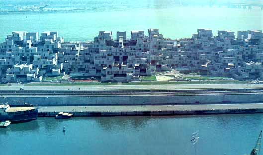 |
Habitat's 158 living units resembled a Taos Indian pueblo. |
As Habitat was designed, it resembled a curious concrete mountain of dwelling places, strikingly modern, yet reminiscent of a Taos Indian pueblo village, or an Italian hill town. Its units were built on the ground, then hoisted by crane into place five, six or more stories above the ground.
A factory was built beside the Habitat site. It contained four large molds in which the standardized units were made. To make each of them, a reinforcing steel cage was placed inside the mold, then concrete was poured around the cage. After the concrete cured, the unit was moved to an assembly line where a wooden sub-floor was installed with electrical and mechanical services below it. Windows and insulation were then inserted; afterwards prefabricated bathrooms and kitchen modules. Finally the unit was moved to its position in the building.
There were 354 of these units in all. But it was the way they were put together than produced the variety of forms that made Habitat, both inside and outside, so unusual. The units were arranged to provide fifteen different types of "houses". These varied from one-bedroom houses (600 sq. feet) to four-bedroom houses (1,700 sq. feet). Each had a private open garden space, 37 x 17 feet. Each man's roof was another man's garden. The arrangement of the units provided privacy and the variation in house layouts provides a sense of uniqueness.
While factory production techniques should have cut overall costs, building 158 apartments isn't really productive in factory work since there is often a steep learning curve. Also since the individual units would bear the weight load of the units above, the units on the bottom where actually thicker and stronger. In the end Habitat 67 cost $22,195,920, or about $140,000 per living unit. Effectively that was the same cost as building six-eight ordinary town houses. Luckily one could rationalize that it was only a prototype, and if scaled up, it might be much cheaper to construct.
While the visiting public was impressed, they didn't embrace the concept. At a distance the complex looked like an exciting piece of Cubist sculpture, at close up it's flat concrete-gray exterior looked boring and as if nobody lived there. Inside the complex Safdie's plastic covered pedestrian streets, connecting the apartments with the elevators and parking lots, were poorly sheltered from Montreal's cold window weather. Perhaps if it had been built near one of Montreal's exciting neighborhoods, the public might have been more willing to accept it, but then few of Expo's fifty million visitors would have seen the innovative housing site.